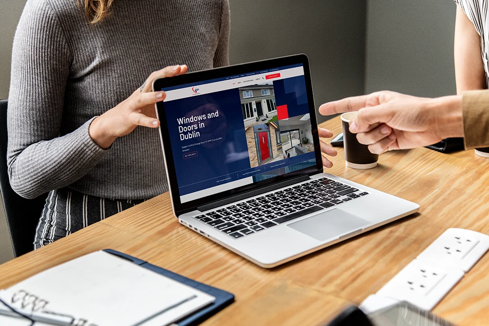
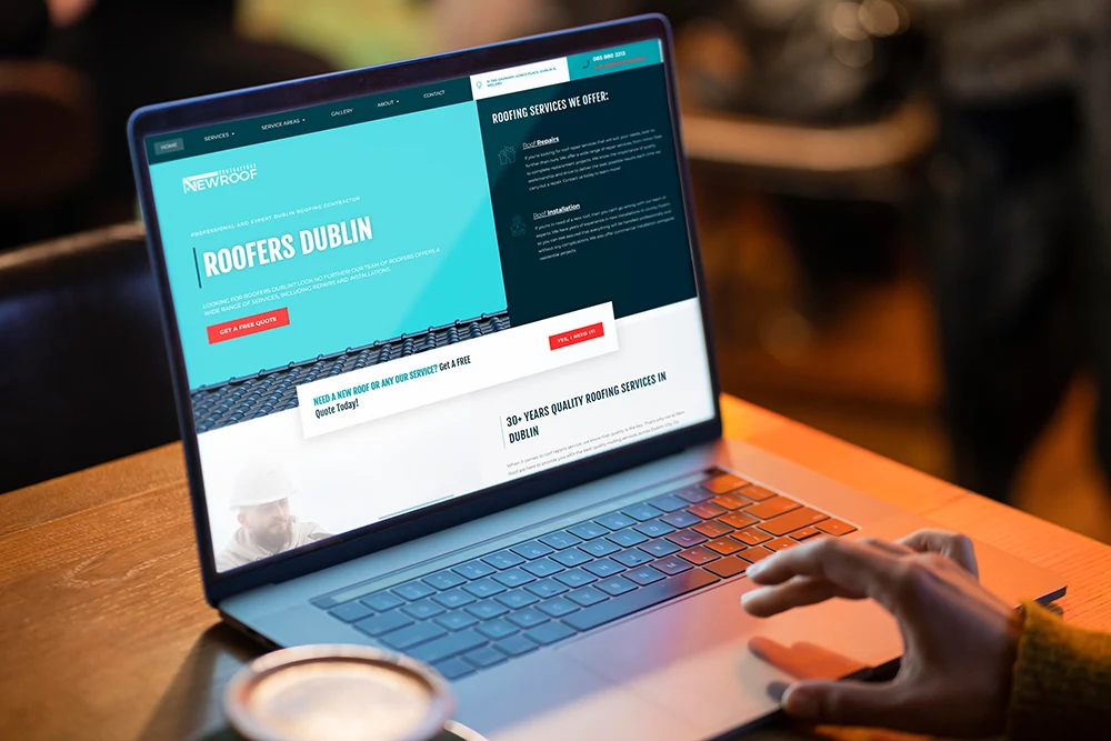
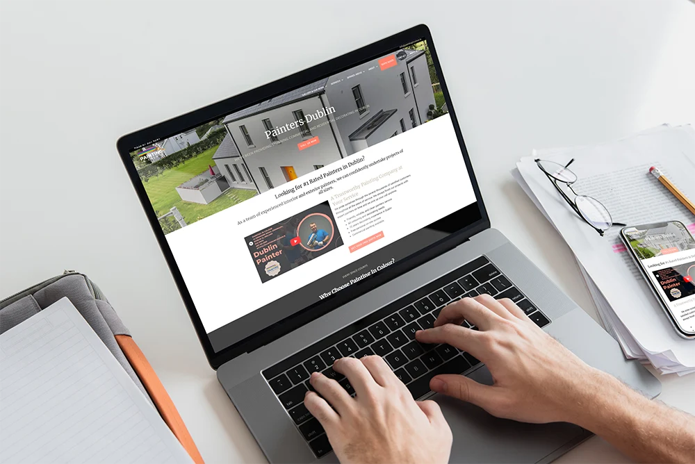
Top Brands Trust Us

Why do you need nice looking website for your Business?
A well-designed site helps build trust and improves user experience.
When your website looks professional, potential customers are more likely to connect with your brand.
A better way to navigate a website helps visitors find what they need quickly.
A strong design can lead to more people taking the action you want, like buying something or contacting your business.
When you invest in good web design, it shows you care about your customers’ happiness.
Webjuice provides ongoing help to make sure websites run smoothly.
We work on building trust and improving how people view the brand.
Our team achieve this by using smart online strategies.
Our Client Feedbacks & Reviews
Franchise SEO & 40+ GBPs
Local SEO and GBP
International Franchise SEO
What Is Included in Our Web Design Service?
Our web design services offer eCommerce sites, local business websites landing pages, and website redesigns.
We build websites that function well on every device with our years of experience.
Our web development and design teams work with the very latest technologies.
We focus on creating designs that look good and work well, customized just for you.
As a leading website development company in Dublin, our web designers offer comprehensive solutions, including continuous improvement and support.
With a proven track record, we create websites that load quickly, are safe, simple to use and with the highest standards.
Our Web Design Services For Your Business
Custom Web Design
Custom web design creates websites that match a business’s needs and goals.
Webjuice provides unique solutions for businesses in Dublin.
This helps their websites be different and catch people’s attention.
Our designs look great on all devices and they make the user experience better and help get more people involved.
Custom web design helps SEO by using simple and clean code.
This design makes websites load faster.
When a website loads quickly, it ranks better in search results.
Webjuice provides support and maintenance to ensure websites work smoothly.
Our web design team helps business owners grow in a tough digital market and gain potential clients yet at affordable prices.
eCommerce Web Design
Effective eCommerce landing pages should focus on boosting sales and looking nice.
They should help visitors take important actions, such as signing up for a newsletter or buying a product.
Key elements are content that is good for SEO. You need clear calls to action.
Quick loading times are also important. Clean code is key too.
Layouts that adjust well help to keep potential customers interested.
These pages need to rank high in search results.
This will improve your online presence.
Our website design agency builds landing pages with helpful features.
This helps boost conversions for eCommerce websites.
Landing Page Creation
Effective landing pages should focus on boosting sales and looking nice.
They should help visitors take important actions, such as signing up for a newsletter or buying a product.
Key elements are content that is good for SEO. You need clear calls to action.
Quick loading times are also important. Clean code is key too.
Layouts that adjust well help to keep potential customers interested.
These pages need to rank high in search results.
This will improve your online presence.
Our website design agency builds landing pages with helpful features.
This helps boost conversions for your local business or eCommerce websites.
Website Redesign
A good website redesign pays attention to how users feel when they use it.
It makes sure the website matches the brand and functions properly.
Website redesigns help a site work better and look nice.
This is all about making the site easy to use and pleasing to the eye.
Redesigns begin with a close look at the current site.
This helps find ways to improve navigation, content, and brand identity.
Mobile optimization is very important. A lot of people read the web on their smartphones and tablets.
SEO best practices are important. Having clean code and fast loading speeds makes users happy.
On-page SEO elements help you show up better in search results.
Our main goal is to create an experience that attracts people and increases sales.
A good redesign improves online presence and makes sure the website runs smoothly.
Responsive Websites
Responsive web design helps websites change to match any screen size.
It improves user experience on all devices, including desktops and smartphones.
A responsive site adjusts easily and offers the best browsing experience.
Responsive WordPress sites look great and work well.
They have clean code, so they load quickly.
These features make users feel happy and can help boost the site’s ranking on search engines.
Responsive design is very important for businesses as they grow.
A well-designed responsive site can adapt when user needs change or when new technology becomes available.
Responsive design keeps users interested. It offers the same experience on all devices.
This lowers bounce rates and encourages people to spend more time on your site.
As a result, it boosts conversion rates and makes customers feel good.
Responsive Websites
Conversion Rate Optimization (CRO) helps get more visitors to your website to do what you want.
CRO looks at how users behave and changes parts of the website to better reach the target audience.
CRO improves a website by targeting important parts.
It makes sure the logo is easy to spot for brand awareness.
Easily-seen buttons and useful contact forms help users.
User experience optimization creates designs that are helpful and good-looking.
Regular testing and making improvements are vital for CRO.
Continuous testing helps websites meet what users want and enjoy.
This method helps increase conversion rates. It also helps businesses grow online.
Search Engine Optimization (SEO)
SEO makes it easier for people to find a site.
It also improves the user experience and raises search engine rankings.
A good SEO plan should include clean code, fast loading times, and optimized items on the page.
These factors help search engines, like Google, find and list websites.
Tracking results and changing based on what the data shows can bring long-term success.
Search Engine Optimization (SEO)
Webjuice provides a service for creating SEO content.
Our SEO team writes text for websites, images, blog posts, and articles.
Our SEO services aim to enhance your online presence and increase your search engine rankings.
We create pictures and videos to help users feel better and tell stories about the brand.
Webjuice writes useful blog posts. This shows they know a lot about their industry.
We put content in a way that makes it easy to find. We also use headings and subheadings.
Webjuice’s content helps businesses create a strong online presence.
Branding & Logo Design
Branding and logo design help businesses create an image.
This means creating special logos and brand parts that show what a company is about.
A good brand design helps people see the company easily. It also makes them feel more trust in it.
The branding process has three main steps. These are research, creativity, and planning.
It means looking at what competitors are doing and checking the latest trends in the industry.
A strong logo helps people remember your brand.
This can result in more clicks. It may also improve rankings in search engines.
Improving your brand strategy helps you stand out on different platforms.
A clear brand identity helps businesses do well online.
What Are the Best Options for a Website?
WordPress and Shopify are two well-known choices for making websites.
Both are easy to use and offer strong features.
They can make SEO results better. They can also boost user engagement.
WordPress is good for many kinds of websites. This includes blogs and bigger sites.
Shopify is great for online stores. Both platforms help your website do well in search results.
They also provide tools to help you reach different business goals.
Your choice will rely on what you want your website to do.
It also depends on the technical details.
Think about how much you want to change it or make it your own.
Think about your budget and how much you want your website to grow.
WordPress Web Design
WordPress is a great CMS that you can easily use for managing your content and you can regularly update your site with useful information.
WordPress gives you lots of themes and plugins to change your site.
It uses clear code, loads fast, and works great on mobile devices.
You can quickly improve titles and meta descriptions on your page.
Tools like Yoast SEO help you see how well a site is doing.
WordPress has a design that is friendly for SEO.
Choosing WordPress is a smart move for any business wanting to do well online.
Shopify Web Design
Shopify is a popular option for building an online store but it may not be the best fit for every business.
Many people appreciate it because it is easy to use and offers many useful features.
People can build nice online stores without needing tech skills.
The app store on the platform helps make functions better.
Shopify provides tools to help you boost SEO and improve your website.
These tools come with clean code, quick loading times, and customizable tags that fit your needs.
The platform provides themes designed for mobile devices.
Shopify users can track their traffic, conversions, and other important numbers.
This allows them to create better strategies for their online stores.
Shopify is a great option for many businesses. It is easy to use and offers strong online shopping tools.
However, bigger companies or those with specific needs may prefer more customized solutions.
Our Web Design and Development Process
Our web design company makes websites that match what clients want and what users need.
Webjuice follows a few steps for web design and development:
- First, we make a plan.
- Next, we look at the design.
- Then, we focus on the content.
- After that, we begin development.
- This is followed by testing.
- Finally, we review the entire project.
Planning
Good planning for a web design project includes several important steps:
- Start by working with clients.
- Set clear goals.
- Identify the target audience.
- Find out what makes your product special.
- Look at market trends and competitors to make sure your website is different.
- Use search engine optimisation (SEO) strategies right away.
- Pay attention to simple code, quick loading times, and effective keyword use.
- Design a clear layout for your site.
Design
The process of web design and development needs good planning.
This process is about user experience (UX) and interface (UI) design.
A design that focuses on getting results means placing calls to action and contact forms in the right places.
This design is good for simple information websites and detailed online shops.
UX design helps people find what they need. It also lets them enjoy nice visuals.
Our website design company makes unique styles that reflect the brand identity.
Good coding and quick loading times make the user experience better.
On-page SEO elements bring in organic traffic.
This means your code should be clean and load fast.
Ongoing support and website maintenance services help keep everything running smoothly for a long time.
Our team works hard to keep the website looking nice and running well as the business grows.
Content Creation
Content creation means making fun and useful material for a specific group of people.
It matters because it catches your attention, improves your visibility on search engines, and increases the chances of getting more sales.
Effective content creation starts with keyword research.
This helps you find the words that potential customers use when they search.
By knowing what they want, you can make content that ranks high in search results.
To do well, focus on creating catchy headlines, useful articles, and clear calls to action.
Having a steady tone and style is very important.
The content should also fit different formats.
This means blog posts, product descriptions, and social media updates.
Development
The development process is key to creating a good website.
You need a strong content plan and a design that shows off the brand.
It starts with turning the brand identity into a practical plan.
This links style with ease of use, making navigation simple.
The process begins with search engine optimization (SEO).
Using clean code and making sure your site loads quickly can help it show up better in search results.
On-page SEO features, like meta tags and keyword optimization, help you get more organic traffic.
The conversion-driven design uses clear action buttons and simple forms.
This approach helps change visitors into customers.
Testing and Review
The testing and review phase looks at how a website works.
It checks the user experience and its SEO features.
Developers check every link, form, and feature.
Usability tests collect feedback from users to make interactions better.
SEO analysis helps improve a website for search engines.
Using meta tags and placing keywords correctly can help a site show up more in search results.
Responsive design tests help ensure you have a good experience on desktops, tablets, and smartphones.
At Webjuice, our professional website design services aim to make a strong and easy-to-use website.
Testing and Review
Webjuice prepares for launches by checking how well the site works and how easy it is to find.
Our team checks how fast the site is. We also see how it works on mobile devices.
We work on improving websites. We look at everything closely and use simple SEO methods.
We have used SEO methods from the very beginning.
We change meta tags, headers, and image alt text. This helps people find us more easily.
We arrange the website structure. This helps search engines find and organize the content better.
During the launch, we keep a close eye on important numbers.
Our skills help businesses be different.
Webjuice can help you make your online presence better.
Post-Launch Maintenance
Post-launch website maintenance means taking care of a site after it is up and running.
This keeps the site current and safe.
The website needs to perform well and succeed.
Some tasks can include checking SEO, improving content, and speeding up the loading time.
It also means using on-page SEO tools well.
Analytics tools watch how users act.
Post-launch care helps your website stay new and easy to find.
It does this by solving technical problems and adding new features.
This helps before the issues get bigger.
People Also Asked
How long does it take to design and launch a website?
Our web development agency usually takes between two weeks and three months to create a website. The turnaround time can change. It all depends on how complicated the website is, what features you choose, and how much you want to customize it. We have the best web design and development service for you in Dublin.
Will my website be mobile-responsive?
Yes, your website will work great on mobile devices. Today, websites need to fit all screen sizes. Our website designers at Webjuice create sites that are a good fit and function well on smartphones, tablets, and computers.
Do you provide custom designs or use templates?
We create custom designs rather than using templates. At Webjuice, our team builds unique websites from the ground up. We do this to match your brand identity. This makes your site different and helps you reach your business goals.
What's your approach to SEO in web design?
Our way of doing SEO in web design starts right from the start. We emphasize using clear code and ensuring the site loads fast. This practice helps to boost search engine rankings. We mix technical SEO with designs focused on users.
Do you offer website maintenance after launch?
Yes, we provide website maintenance after your site is live. Our services include updates, fixing security problems, and regularly making backups.
Can you integrate e-commerce functionality?
Yes, we can add online store features to your website. Our service has special online store options made just for you. We want to make shopping easy for you. We use safe ways to pay, simple product lists, and easy shopping carts.
Do you offer ongoing support?
Yes, we provide ongoing help for our web design services. Our support makes sure your website stays up-to-date and runs smoothly. We take care of updates, fix problems, and add new features.
How do you ensure site security?
We keep our site safe by taking strong steps. Webjuice uses SSL certificates to protect data transfers. Our team checks the security often to find any weak points. We use firewalls and security plugins to protect our system from malware and hackers. This way, we can respond quickly if we notice any unusual activity.
Can you create a custom, branded design?
Yes, we can create custom, branded designs. Webjuice creates special website designs that match your brand’s identity. We look at what makes your business unique and important in every part of the site. This way, you will be different in the online space.
