
In the competitive landscape of online commerce, your website’s architecture is the foundational blueprint that determines success or failure. Far more than mere aesthetics, a strategically designed e-commerce structure directly catalyzes superior user experience and dominant search engine visibility. This essential framework guides visitors effortlessly from discovery to purchase while simultaneously providing search engines with the clear signals needed to rank your pages effectively. By prioritizing intuitive navigation, logical categorization, and a mobile-first design, businesses can dramatically reduce bounce rates, enhance user engagement, and foster customer loyalty. This guide delves into the core principles of high-performing e-commerce architecture, exploring the pivotal types of structures—from single-vendor stores to expansive marketplaces—and outlining the best practices that merge usability with technical SEO excellence. We will examine how optimized URL structures, strategic internal linking, and rigorous mobile optimization work in concert to create a seamless journey for both users and search engine crawlers. Understanding and implementing these robust architectural strategies is not an optional enhancement but a critical imperative for any business aiming to increase organic traffic, accelerate conversions, and achieve sustainable online growth.
Key Takeaways
- A clean and well-organized e-commerce site helps users feel good. It lowers bounce rates and improves SEO with easy navigation and clear categories.
- There are several types of ecommerce setups. These include single-vendor, multi-vendor, marketplaces, and dropshipping. Each has its benefits and problems.
- Using the best practices for navigation is key. Dropdown menus and breadcrumb trails make it easier to find products and improve user happiness.
- A good URL structure with clear, keyword-rich text helps users and makes the site easier to notice in search engines.
- A design that works on mobile devices is very important. It keeps users coming back, improves SEO, and boosts sales because many people browse on their phones.
Importance of Website Architecture
Website structure makes it easier for users to navigate and helps with search engine ranking.
A good layout lets search engines find and index your content properly.
This makes your products easier to find.
Knowing how to improve e-commerce SEO is key to online success.
A strong e-commerce architecture structure is the base for all good optimization plans.
Think about a possible customer looking for a certain item.
A bad website design can cause frustration and make them leave.
Easy navigation, clear categories, and a simple checkout can lower bounce rates and increase sales.
Additionally, good design helps your site work well on mobile devices.
So, making your design fit for mobile can help improve your search rankings.
Types of Ecommerce Structures
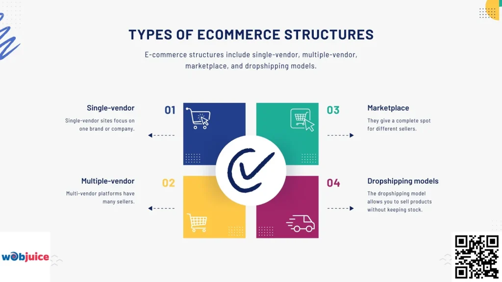
E-commerce structures include single-vendor, multiple-vendor, marketplace, and dropshipping models.
These setups meet different business models and customer needs.
Single-vendor sites focus on one brand or company.
This setup helps people stick to the brand and makes managing products easier.
Link-building strategies can help increase the visibility of these structures.
This can result in more organic traffic and sales.
Multi-vendor platforms have many sellers.
They offer customers more options for products.
Marketplaces like Amazon or eBay do this more.
They give a complete spot for different sellers.
The dropshipping model allows you to sell products without keeping stock.
This setup lowers your initial costs and risks.
Every structure has its benefits and difficulties. Pick one that fits your business goals.
Best Practices for Navigation
Start with a clear main menu that has important categories.
Think about how your visitors will move through your site—put related products together and use clear labels.
Using good SEO tips for your navigation can help your online store get seen and improve its search engine rank.
Use dropdown menus.
This clears up your interface while still allowing for deeper choices.
You should add a search bar in a visible spot on your site.
Think about mobile users.
Make sure your navigation fits well and is simple to use on small screens.
Try out different layouts to find what is best for your audience.
Add breadcrumb navigation.
This helps people know where they are on your site. It’s a simple way to improve usability.
SEO Considerations for Architecture
Mastering on-page SEO is key to improving your website’s visibility and performance in search results.
This means you should optimize meta tags, headers, and content for important keywords.
A good URL can help more people find your site.
It makes it easier for search engines and customers to get around.
A good internal linking plan makes it easier for users to navigate.
Making sure your design works well on mobile can help improve your rankings.
These parts come together to build a strong SEO base for your online store setup.
URL Structure Optimization
Optimizing your URL structure is important for a good user experience and search engines.
A clear URL helps search engines understand your site better.
This can lead to better rankings, more visibility, and more traffic.
A good URL is short and clear.
It uses keywords that relate to the page content.
Do not use extra parameters or numbers.
They can confuse users and search engines.
Use hyphens to break up words.
Keep the same structure throughout your site.
Use your brand name in the URL.
Internal Linking Strategy
Use good anchor text for your internal links.
This helps users find their way and gives more details to search engines.
Link to important, quality pages to improve their visibility in search results.
Balance the links you use.
Don’t put too many links on one page.
Spread them out on the important pages.
Show off the main products or categories.
By following these practices, you’ll improve site routing and SEO performance.
Mobile-Friendly Design
To make your mobile design better, make sure your site loads fast.
It should also show content clearly on smaller screens.
Use responsive design to change your layout for different devices.
Making navigation easy is important.
Users should be able to find products and buy them without any trouble.
Think about using touch-friendly items to make things easier to use.
Keep buttons and links far enough apart to stop wrong clicks.
These changes can make users happier and show search engines that your site is set up well, which can help improve your rankings.
Mobile Optimization Strategies
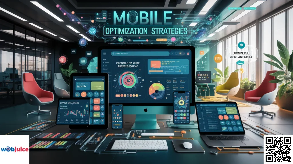
First, check that your site has a design that works well on different screen sizes.
This helps users have a better experience and can improve your rankings on search engines.
Effective local SEO can help your business stand out and draw in nearby customers looking for products or services you provide.
Next, make loading times better.
Mobile users want fast access to information.
Shrink images and reduce code to improve performance.
Tools like Google PageSpeed Insights can help you find areas to work on.
Also, use features made for mobile, like click-to-call buttons.
They help make buying easier and keep users more engaged.
Don’t forget about navigation.
Make your menus simpler and check that buttons can be clicked easily.
This helps reduce frustration for people using mobile devices.
Analyzing User Experience
To understand the user experience better, look at site speed, ease of navigation, and how easily the content can be accessed.
Quick-loading sites help reduce shopping cart drop-offs.
A responsive design makes sure that content appears well on every device.
Technical SEO practices help to improve site speed and make it mobile-friendly.
Check your site’s navigation.
Users should be able to find products easily and without frustration.
Simple menus and clear categories can improve the shopping experience.
Use tools to track how users behave.
Clear and useful product descriptions help customers decide what to buy and can also boost SEO rankings.
E-commerce Website Architecture FAQ
Expert answers to common questions about e-commerce site structure, SEO optimization, and user experience best practices
1. How does website architecture directly impact my e-commerce store’s SEO performance?
Beyond crawlability, a well-planned architecture supports a robust internal linking strategy, which distributes page authority (link equity) to important commercial pages while keeping users engaged longer—both signals that search engines interpret as indicators of a high-quality, relevant site.
Conversely, poor architecture often leads to:
- Crawl budget waste and errors
- Content duplication issues
- Increased bounce rates from frustrated users
- Difficulty for search engines to establish page importance
These factors can significantly suppress your search rankings and reduce organic visibility for critical product-related keywords.
2. What’s the difference between single-vendor and multi-vendor e-commerce structures?
Single-Vendor Structure (D2C/Brand-Centric)
Features products exclusively from one seller/manufacturer. This model is typical for direct-to-consumer (D2C) brands like Warby Parker or Allbirds.
- Pros: Complete control over branding, customer experience, pricing, and fulfillment. Enables building a strong, cohesive brand identity with consistent messaging.
- Cons: Limited catalog size, requiring significant marketing investment to drive traffic.
Multi-Vendor Structure (Marketplace Model)
Hosts products from numerous third-party sellers. Examples include Amazon, Etsy, or Walmart Marketplace.
- Pros: Rapid catalog expansion, vast product variety attracting broader audiences, revenue through commissions and fees.
- Cons: Complex vendor management, inconsistent quality control, potential brand dilution, and competitive pricing pressures.
Choosing the Right Model: Opt for single-vendor if brand control, curated experience, and higher margins are priorities. Choose multi-vendor if your goal is becoming a one-stop destination with maximum selection and scalable revenue through commissions.
3. Why is mobile-friendly design essential for modern e-commerce?
1. User Traffic Dominance
With over 60% of global e-commerce traffic originating from mobile devices, a site that fails on smaller screens alienates your primary audience. Mobile shoppers expect seamless experiences comparable to desktop.
2. Core SEO Ranking Factor
Google uses mobile-first indexing, meaning it primarily uses the mobile version of your content for indexing and ranking. Sites without responsive design or with poor mobile usability face significant ranking penalties in search results.
3. Direct Conversion Impact
A mobile-optimized site with touch-friendly buttons, simplified navigation, accelerated mobile pages (AMP), and fast load times directly reduces cart abandonment and increases sales from on-the-go shoppers. Mobile users demonstrate higher intent and expect immediate, frictionless access to products.
Best Practices Include: Responsive frameworks, compressed images, simplified checkout processes, large touch targets, and avoiding intrusive pop-ups that hinder mobile navigation.
4. What makes an SEO-friendly URL structure for product pages?
Essential Characteristics of SEO-Optimized URLs:
- Readability & Separation: Use hyphens to separate words (blue-running-shoes) rather than underscores, spaces, or special characters.
- Keyword Placement: Naturally include primary product keywords early in the URL slug while maintaining relevance to page content.
- Conciseness: Keep URLs short, descriptive, and avoid unnecessary parameters, session IDs, or filler words (like “a,” “the,” “and”).
- Logical Hierarchy: Reflect your site architecture (e.g., /electronics/headphones/wireless/) to reinforce content organization.
- Consistency: Maintain standardized format across all pages. Avoid mixing different URL structures.
Examples:
SEO-Friendly: yourstore.com/apparel/men/organic-cotton-t-shirt
Poor SEO Practice: yourstore.com/product.php?id=1234&cat=56&session=abc789
Well-structured URLs are crawled efficiently, shared more easily, and contribute positively to your site’s overall SEO health.
5. How does strategic internal linking improve UX and SEO?
A strategic internal linking plan creates an interconnected web within your site that delivers dual benefits for user experience (UX) and search engine optimization (SEO).
Benefits for User Experience (UX):
- Navigation Aid: Guides visitors to discover related products, complementary items (“frequently bought together”), or supporting content (blog posts, size guides).
- Engagement Boost: Keeps users on your site longer by providing relevant pathways, which decreases bounce rates and increases the likelihood of conversion.
- Contextual Support: Helps explain complex products by linking to demonstration videos, detailed specifications, or customer reviews.
Benefits for Search Engine Optimization (SEO):
- Page Authority Distribution: Transfers “link equity” or ranking power from high-authority pages (homepage, popular blog posts) to deeper, newer, or important commercial pages that need a ranking boost.
- Crawlability Enhancement: Helps search engine crawlers discover and index pages more efficiently, ensuring fresh content gets recognized quickly.
- Topical Relevance Signals: Establishes content silos and demonstrates to search engines how pages relate to each other, strengthening your site’s overall authority on specific subjects.
- Ranking Improvement: Pages with more internal links pointing to them are often perceived as more important, potentially improving their rankings for target keywords.
Effective internal linking uses descriptive anchor text, prioritizes user intent, and creates a logical content hierarchy that benefits both human visitors and search algorithms.
Summary
In summary, a sophisticated e-commerce architecture is the indispensable engine that drives both user satisfaction and search engine success. By integrating the core strategies outlined—clear navigation, a mobile-responsive design, and an SEO-optimized technical foundation—you create a powerful synergy that propels your online store forward.
For Users: A logical, fast-loading site with effortless navigation reduces friction, lowers bounce rates, and builds trust, leading directly to higher conversion rates and customer retention.
For SEO: A clean, crawlable structure with optimized URLs and strategic internal linking allows search engines to efficiently index and understand your content, significantly boosting your visibility for critical product-related keywords.
Ultimately, investing in a robust website architecture is an investment in your brand’s future. It establishes a scalable framework that not only meets the immediate demands of today’s mobile-centric shoppers but also adapts to evolving algorithms and market trends. By mastering this foundational element, you secure a sustainable competitive advantage, turning casual browsers into loyal customers and solidifying your presence at the forefront of digital commerce.