Free SEO + AI Search Snapshot
We check the current website, Google visibility, local SEO foundation, tracking, competitors, and whether the site is ready to grow.
As an SEO agency in Dublin, Webjuice reviews your website, Google visibility, local SEO, AI search readiness, tracking and ad readiness, then tells you what to fix first. If the website foundation is weak, we fix that before selling monthly SEO or ads.
We’ll send your private snapshot link by email within 24 hours.
Funnel · Simple by design
You do not need to choose between confusing SEO packages. Start with the free snapshot. We’ll check the website, local visibility, tracking, competitors, and whether the current site is ready for SEO or ads.
We check the current website, Google visibility, local SEO foundation, tracking, competitors, and whether the site is ready to grow.
If the website is the problem, we rebuild the foundation with faster pages, stronger service/location structure, GBP alignment, schema, FAQs, tracking, redirects, and conversion-focused pages.
After the foundation is fixed, we can grow it with SEO Care, Google Ads, Facebook Ads, or a combined Growth Plan.
Recommended Path · Guided SEO funnel
Most businesses do not need a monthly retainer first. We check what is blocking rankings, calls, and leads, then recommend the right next step: a focused SEO fix, a Growth Matrix rebuild, or monthly growth if the foundation is already strong.
We review the current site and send one clear recommendation by email.
If the website is too slow, thin, messy, or hard to rank, we rebuild the foundation before selling monthly growth.
After the foundation is fixed, we grow the business with the channel that makes sense.
Start with the free snapshot. We’ll tell you whether you need a focused SEO fix, a Growth Matrix rebuild, monthly growth, or nothing yet.
Start With Free SEO + AI Snapshot →You can stop after the one-time fix. Monthly growth is optional and only recommended when continued SEO or ads are likely to be worth it.
Reviews · Verified on Google
Before, we barely showed up on Google Maps and our website wasn't bringing in customers. A friend referred us to Webjuice and they delivered real results fast. Professional, supportive, and very affordable. Highly recommend to any business that wants better local visibility and more enquiries.
Big thanks to Mike and the Webjuice team. They sorted out our Google Business Profile and within about five months we started getting noticeably more calls and enquiries. Professional, responsive, genuinely knowledgeable — clear advice, no fluff, and the results really do speak for themselves.
Webjuice helped me grow my business online and made real improvements to my website along the way. They explained everything clearly, focused on what would actually move the needle, and delivered results without the usual fluff. Practical, consistent, and genuinely supportive.
Webjuice have been fantastic to work with. They really took the time to understand our business and quickly improved our visibility on Google. Clear communication, measurable results, and they genuinely care about helping us grow. We've seen a real increase in quality leads since working with them.

Webjuice · Dublin
Webjuice helps businesses grow through practical SEO Dublin services, local visibility, high-intent content, and better-performing websites. We focus on what actually moves rankings, leads, and revenue — not bloated reports, recycled strategy decks, or vague recommendations.
Direct work, clear scope, and pages that earn their place in search. That's the deal, and it hasn't changed since we started.
Watch · 60 seconds
A short walkthrough of the agency model — how Webjuice combines SEO, AI search visibility, and conversion-focused websites to grow Dublin and Irish businesses.

Services · What we actually do
From classic technical SEO to AI search visibility, fast Matrix websites, and e-commerce — we focus on the work that drives real traffic and qualified enquiries. See the full SEO services in Dublin we deliver every month, or dive into our specialist Local SEO Dublin engagement.
Be the answer ChatGPT, Perplexity, Claude, and Google's AI Overviews cite. We optimise your content, entity signals, and authority for the search experience that's quietly taking over how buyers find businesses — before your competitors notice it's happening.
AI SEO & GEO services →Fix the issues holding your site back — crawl problems, indexing errors, internal linking gaps, weak page structure, speed, and on-page fundamentals.
Explore Technical SEO →Show up where local buyers are actually searching. We improve Google Business Profile visibility, local landing pages, citations, and map pack performance.
Explore Local SEO →We build service pages and supporting content around search intent, not fluff, so your site ranks for the terms that lead to enquiries and sales.
Explore SEO Content →Optimise category pages, product schema, internal search, and faceted navigation so your store ranks for the buying terms that move revenue — not just traffic.
Explore E-commerce SEO →Traffic means nothing if the page doesn't convert. We improve structure, messaging, layout, and calls-to-action so more visitors turn into leads.
Explore Conversion Pages →Lightning-fast SEO websites built on clean, modern architecture and deployed to the edge. CWV-focused, structured, and engineered to load before competitors finish painting.
Explore Matrix Websites →Sound familiar?
If any of this sounds familiar, your website likely has bigger SEO and conversion issues than it seems.
Your site gets traffic but barely generates leads.
You're not showing up for the searches that actually matter.
Competitors with weaker businesses keep outranking you locally.
Your service pages are thin, weak, or targeting the wrong keywords.
You paid for SEO before and got reports instead of results.
Your Google Business Profile isn't helping enough.
Your website looks decent but doesn't convert visitors into enquiries.
You know SEO matters, but you don't know what to fix first.
Every agency promises rankings, but nobody explains how that turns into revenue.
Results · SEO that moves the numbers
Technical fixes, local landing page improvements, and better service page targeting helped turn existing traffic into stronger enquiries.
We improved location page structure, internal linking, and local search relevance to strengthen rankings across key service areas.
On-page SEO, improved copy structure, and clearer calls-to-action helped organic visitors take action instead of bouncing.
Industries · Specialist SEO playbooks
Latest posts · SEO insights
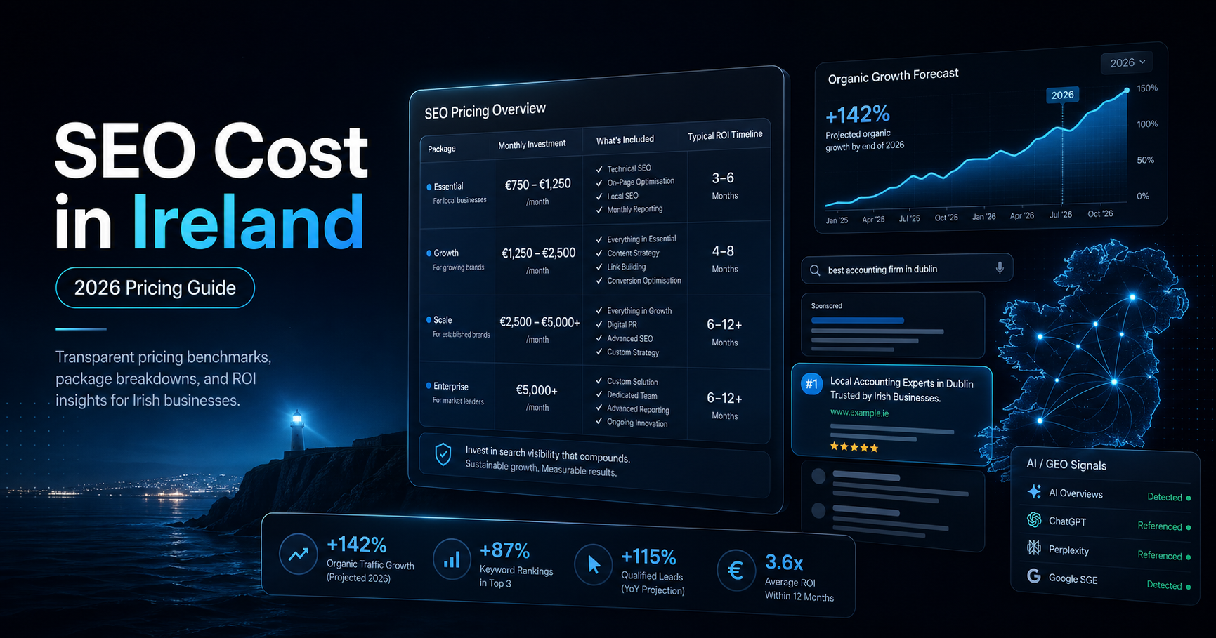
Realistic 2026 budgets for monthly SEO, local vs national scope, audits, e-commerce, and GEO AI SEO.
Read the pricing guide →
An honest shortlist with notes on senior involvement, process, pricing transparency, and technical depth.
Read the full post →
A comparison through speed, SEO foundations, conversion quality, and maintainable builds.
Read how to build them →FAQ
The things businesses usually ask before starting SEO properly.
Start with a free SEO + AI Search Snapshot. We’ll show you what is blocking traffic, calls, and leads, then recommend the simplest path: a focused SEO fix, a Webjuice Growth Matrix rebuild, or monthly growth.