
In today’s digital landscape, where over 60% of web traffic originates from mobile devices, a mobile-optimized website is no longer optional—it is the cornerstone of online survival and success. Users now demand instantaneous, seamless experiences, with statistics showing they will abandon a site in just three seconds if it fails to load quickly or function intuitively on their smartphone. This reality is compounded by Google’s definitive mobile-first indexing, which prioritizes mobile-friendly sites in search rankings, directly linking poor optimization to diminished visibility, lost revenue, and buried organic traffic.
However, this challenge presents a profound opportunity. Transforming your site into a high-converting mobile magnet is an achievable strategic imperative. This comprehensive guide details the essential pillars of effective mobile optimization, moving beyond mere technical compliance to embrace core principles of user respect and frictionless engagement. We will explore how to leverage responsive design as a non-negotiable foundation, implement critical speed optimization techniques like image compression and caching, and design intuitive, thumb-friendly navigation. Furthermore, we will delve into the critical art of enhancing content readability through legible typography, strategic contrast, and optimal spacing—all tailored for the on-the-go user. By systematically applying these actionable strategies and rigorously testing with tools like Google’s Mobile-Friendly Test, you can significantly boost user engagement, drive conversions, and secure a competitive edge in the mobile-centric marketplace. Mastering mobile optimization is ultimately about honoring your audience’s time and attention, a commitment that pays dividends in both superior SEO performance and sustainable business growth.
Key Takeaways
- Your website can be mobile-friendly by using a responsive design. Also, speed optimization is important. Make sure your navigation is simple. The content should be easy to read. Finally, do regular testing.
- Responsive design helps your website fit different screen sizes. This improves user experience on all devices. Speed optimization includes compressing images, reducing HTTP requests, and turning on browser caching. These actions result in quicker loading times.
- Simple navigation with clear labels and a few menu items helps users find important pages on mobile. For better content readability, use a font size of at least 16 pixels and keep high contrast. This makes text easier to see on smaller screens.
- Test if your site works well on mobile using Google’s Mobile-Friendly Test tool. Check mobile traffic and bounce rates often. This helps with improvement.
Understand Mobile User Behavior
Mobile users want quick and easy experiences on their devices.
They use their phones while moving, waiting in line, or resting at home.
This means they expect fast loading times and content that is simple to use.
Website speed optimisation is crucial for keeping mobile users and enhancing overall user experience.
Using methods like shrinking images and reducing HTTP requests can help make sites better for mobile devices.
Mobile users like short information.
They want the main points at the start, so put those first.
Use headings and brief paragraphs to help them read quickly.
Think about how far a thumb can reach when you design your site.
Users should be able to tap buttons easily without getting frustrated.
Context is important for mobile users.
This means you should optimize your content for local SEO.
You also need to make sure it connects with what users want.
Utilize Responsive Design

Implementing responsive design will help your site to do better in the future.
Google prefers websites that work well on mobile devices, so a design that adapts can make you more visible.
Using one URL for all devices makes SEO easier.
You won’t have to handle different mobile and desktop versions.
Responsive design also makes loading times faster and improves the user experience.
This can lead to more people taking action.
Visitors are more likely to interact with content that looks good on their devices.
Using responsive design is important for websites that want more visitors and better performance.
This method will help your website succeed on all devices.
Optimize Website Speed
Begin by making image sizes smaller.
This will help loading times and make the user feel better.
A technical SEO checklist should improve CSS and JavaScript files.
It should also use a content delivery network (CDN).
Browser caching is another important tool.
It cuts down the wait time for visitors who come back.
Remember to reduce HTTP requests and turn on compression.
Think about using a simple theme or template.
Regular testing of performance helps find areas to improve.
By using these strategies, you will make a faster and more friendly website.
Minimize Image Sizes
You can reduce image sizes by compressing them, choosing the right file format, and using responsive images.
These ways will help your website load quicker and keep visitors interested.
Start with reducing file sizes.
Use tools like TinyPNG. or JPEGmini to make files smaller without losing quality.
Find the right balance between size and how the image looks.
A nicely compressed image loads fast and still appears good.
Next, pick the right file format. JPEGs are great for photos.
PNGs are better for images with fewer colours.
Lastly, use images that change size for different screens.
It makes loading faster and improves the user experience on all devices.
By following these steps, you will lower bounce rates and keep possible customers on your site.
Leverage Browser Caching
To set this up, change your server settings or use a content management system that has caching options.
Remember to set cache times.
Keep simple resources cached for at least a week.
Let files that change often refresh more quickly.
Using browser caching is easy but works well.
It speeds up your website, makes users happier, and helps with SEO.
Your site looks better to both visitors and search engines.
After making image sizes smaller, the next step is to use browser caching for a faster website.
Act now to enjoy the benefits of this easy but effective method.
Simplify Navigation

Here are some tips to improve your navigation:
- Limit the number of menu items.
- Focus on important pages like home, services, and contact.
- Use a hamburger menu to save space.
- Ensure buttons are big enough to touch.
- Small buttons can lead to mistakes and reduce the user experience.
- Use clear labels for navigation links.
- Do not use complicated words.
- Use simple language to explain content.
Focus on Content Readability
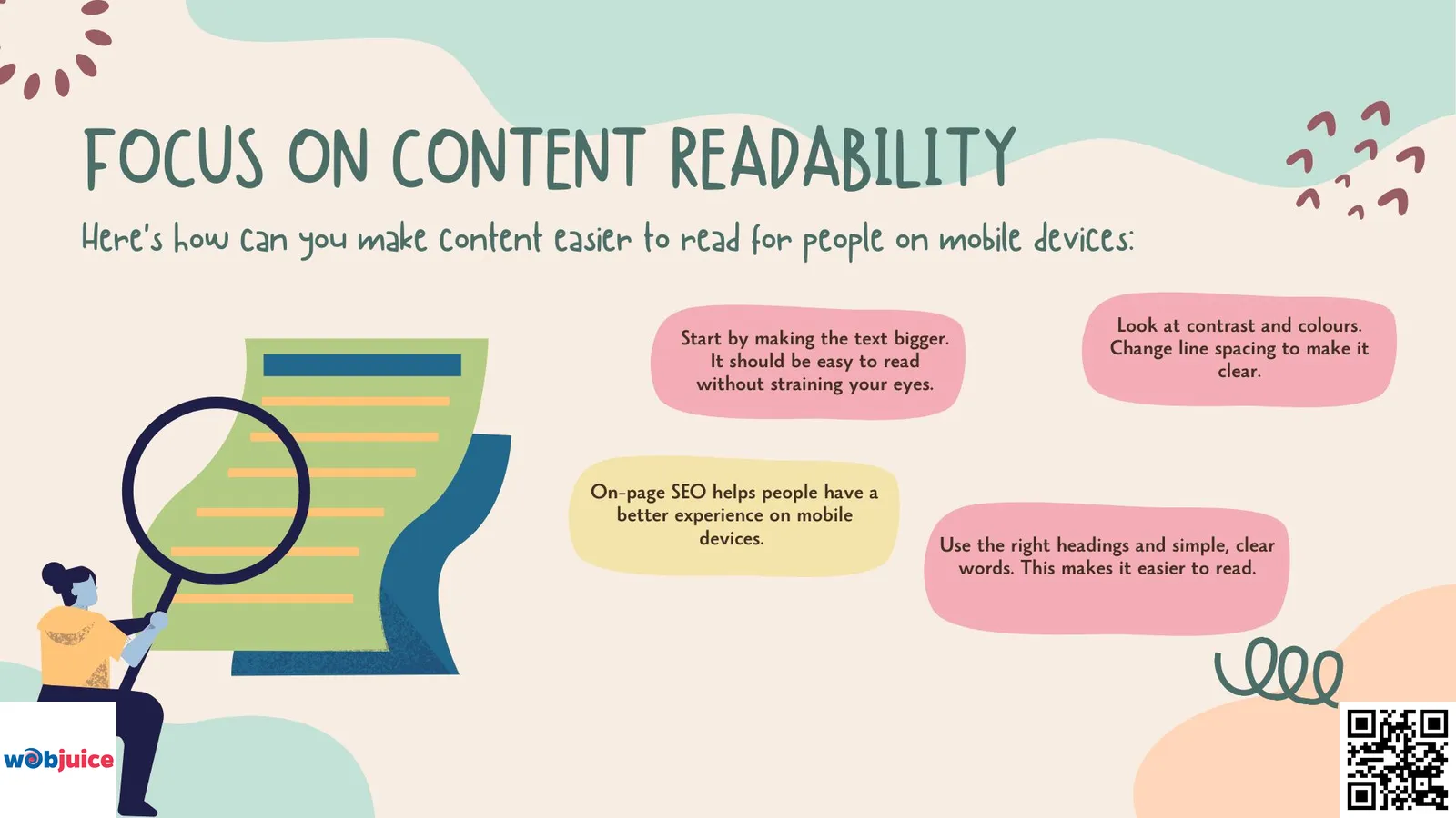
Here’s how you can make content easier to read for people on mobile devices:
- Start by making the text bigger. It should be easy to read without straining your eyes.
- On-page SEO helps people have a better experience on mobile devices. Use the right headings and simple, clear words. This makes it easier to read.
- Then, look at contrast and colours. Change line spacing to make it clear.
These steps will make your content welcoming for everyone.
Font Size Optimization
The best font size for text on mobile devices should be at least 16 pixels.
This size helps most users read comfortably on smaller screens.
Optimizing font size is important.
It helps keep visitors interested and lowers bounce rates.
Headings need to be larger and look different. This sets a clear order.
It helps readers understand your content better.
Use the same font style for your whole site.
Don’t forget to think about line spacing and paragraph length.
A good amount of space between lines helps make text easier to read.
Short paragraphs work better on small screens.
Make your design adjust well.
Your font size needs to change depending on the screen size.
Use CSS media queries to ensure your content looks good on every device.
Font size optimization is important for user experience.
Keep in mind that picking a good font size makes your content easier to read.
Contrast and Colors
To make text easy to read, strive for a contrast ratio of at least 4.5:1 for regular text.
This can enhance the user experience and keep them engaged.
Also, think about colour-blind users by skipping tricky colour pairs like red and green.
Tools such as colour contrast checkers can help you ensure your choices follow accessibility rules.
Consistent colour schemes on your site can create a unified look.
This helps build trust and credibility.
When users feel at ease moving around your site, they are more inclined to explore.
This can increase your chances of making a sale.
Line Spacing Adjustments
Use a line height that is about 1.5 times the size of the font.
This gives enough room between lines without making big gaps.
A better reading experience helps visitors stay on your page longer.
This improves user satisfaction and helps your SEO rankings.
Consider changing the spacing for different sections.
This makes a clear layout.
It helps readers understand the content better.
By adjusting the line spacing, you are not only making it easier to read.
You are also helping your website to perform better.
A layout with good spacing keeps content interesting.
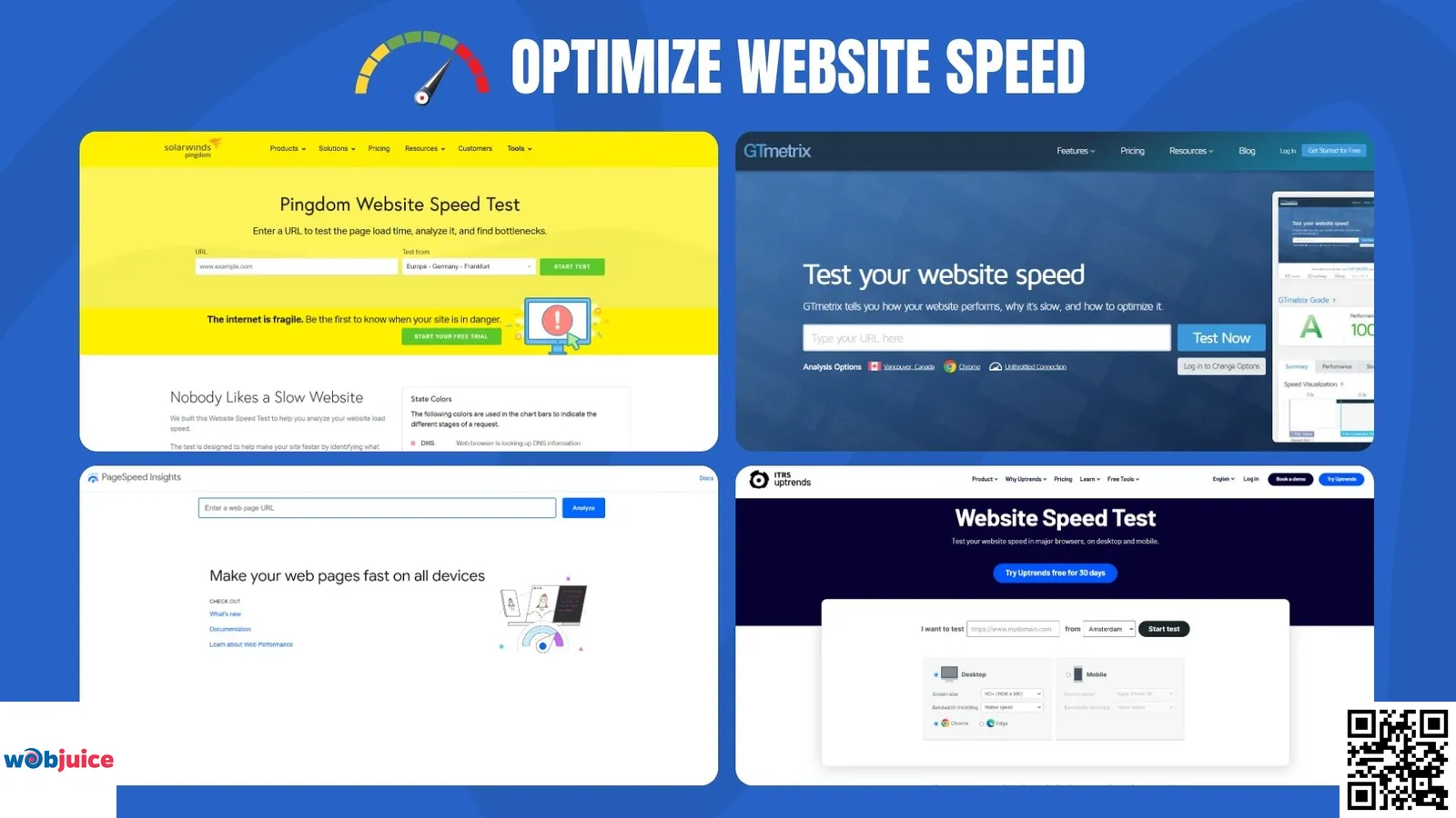
Test Your Mobile Friendliness

Here are the steps in testing if your website works well on mobile:
- Start by using Google’s Mobile-Friendly Test tool.
- Enter your website’s URL, and the tool will check how well it works on mobile. It will give you helpful information.
- Also, think about adding an XML sitemap. This can help search engines find and read your mobile-friendly pages better. It can make your site easier to see and use on different devices.
- Look for common problems like how the view area is set up and how far apart the touch items are. These things affect how users feel about the site. If the items are too close, people might have a hard time moving around, which could make them feel upset and could lead them to leave the site.
- After finding problems, make changes. Fix your images and check that your text is easy to read without zooming. A responsive design is important; your site should change to fit different screen sizes easily.
- Monitor your site’s performance with Google Analytics. Look closely at mobile traffic and bounce rates. High bounce rates can show that the mobile experience is not good. This should lead you to investigate and improve things.
Mobile Optimization FAQ
Essential questions and answers about mobile website optimization, responsive design, and SEO best practices for the mobile-first era.
Why is mobile optimization so critical for my website’s success?
Mobile optimization is essential because it directly impacts your visibility, user engagement, and revenue. With Google’s mobile-first indexing, your site’s mobile version is the primary benchmark for ranking. A poor mobile experience leads to high bounce rates, lost conversions, and lower search rankings.
Furthermore, as the majority of web traffic is now mobile, an unoptimized site ignores your core audience. It’s a fundamental business imperative, not just a technical task, ensuring you respect users’ time and provide the frictionless experience they demand on their primary device.
What is the single most important element of mobile optimization?
While all elements are interconnected, implementing a responsive web design (RWD) is the most critical foundational element. A responsive design uses flexible layouts and CSS media queries to automatically adapt your site’s content, images, and structure to fit any screen size—from desktop to smartphone.
This eliminates the need for separate mobile URLs, simplifies SEO management, and provides a consistent user experience. Google explicitly recommends RWD as a best practice, making it the non-negotiable starting point for any mobile strategy.
Key benefits of responsive design:
- Single URL structure for better SEO
- Improved user experience across all devices
- Easier website maintenance
- Higher conversion rates
- Better Google Search rankings
How can I significantly improve my mobile site’s loading speed?
Improving mobile speed requires a multi-faceted technical approach focused on reducing page weight and server requests:
- Image Optimization: Compress all images (using tools like ShortPixel or Squoosh) and serve them in next-gen formats like WebP. Implement responsive images with the
srcsetattribute. - Leverage Caching: Enable browser caching to store static resources locally on a user’s device, drastically speeding up repeat visits.
- Minify Code: Minify CSS, JavaScript, and HTML files to remove unnecessary characters without affecting functionality.
- Use a Content Delivery Network (CDN): A CDN serves your site’s assets from servers geographically closer to the user, reducing latency.
- Audit with Core Web Vitals: Use Google PageSpeed Insights to identify and fix specific issues impacting Largest Contentful Paint (LCP), First Input Delay (FID), and Cumulative Layout Shift (CLS).
What are the best practices for mobile-friendly navigation and readability?
For navigation, adopt a “less is more” philosophy. Use a recognizable hamburger menu, limit top-level menu items, and ensure all touch targets (buttons, links) are at least 48×48 pixels.
For readability, treat typography as a priority:
- Font Size: Use a base font size of at least 16px for body text to prevent zooming.
- Contrast: Maintain a high color contrast ratio (4.5:1 minimum) between text and background.
- Spacing: Use ample paragraph spacing and line height (around 1.5em) to improve scanability.
- Layout: Employ a single-column layout with clear, scannable headings and plenty of white space to avoid a cluttered feel on small screens.
These practices not only improve user experience but also contribute to better SEO performance through longer session durations and lower bounce rates.
How do I test and maintain my website’s mobile performance over time?
Continuous testing is key to maintaining optimal mobile performance:
- Initial Audit: Use Google’s Mobile-Friendly Test and PageSpeed Insights for a comprehensive baseline report.
- Real-Device Testing: Regularly check your site on various actual smartphones (iOS, Android) to experience it as users do.
- Analytics Monitoring: In Google Analytics 4 (GA4), monitor mobile-specific metrics like bounce rate, session duration, and conversion rates. Set up a custom report to compare mobile vs. desktop performance.
- Ongoing Checks: Integrate mobile testing into your content publishing workflow. Every new page or update should be validated for mobile usability, ensuring long-term standards are upheld and identifying regressions promptly.
Conclusion
Mastering mobile optimization is a continuous process that directly fuels your online visibility and user engagement. By integrating the core strategies outlined, you future-proof your website and align with both user expectations and search engine algorithms.
Immediate Action Steps for Success:
Implement Responsive Design: Ensure your website adapts flawlessly to all screen sizes. This is the critical first step for user experience and SEO.
Prioritize Speed: Compress images, minimize HTTP requests, and leverage browser caching. Site speed is a paramount ranking factor and a key to reducing bounce rates.
Simplify Navigation: Create intuitive, thumb-friendly menus with clear labels. Streamlined navigation guides users effortlessly to conversion points.
Optimize Readability: Use a minimum 16px font size, high-contrast colors, and adjusted line spacing. Legible content retains visitors and encourages longer session durations.
Test and Analyze Rigorously: Utilize Google’s Mobile-Friendly Test tool consistently. Monitor mobile traffic and bounce rates in Google Analytics to identify and rectify pain points.
Final Insight: Mobile optimization transcends technical tweaks; it is a fundamental commitment to providing a respectful, efficient, and accessible user experience. By embracing these principles, you not only satisfy search engine criteria but also build trust with your audience, leading to enhanced engagement, higher conversion rates, and sustained organic growth. Begin auditing your site today to secure your place in the mobile-first future.