Is your website dragging its feet? Blame the hidden culprit: unoptimized images. In a digital world where speed is currency and attention is gold, bulky, lazy visuals are more than an oversight—they’re a business killer. They strangle your load times, chase visitors away, and tell search engines your site isn’t worth ranking.
But what if every image could work for you, not against you? This is your masterclass in turning visual content into your greatest asset. We’re cutting through the noise to deliver the proven, actionable steps that transform sluggish pages into lightning-fast experiences. You’ll discover the simple secrets behind choosing the right format (JPEG vs. PNG is just the start), the magic of smart compression that keeps quality crystal clear, and the SEO power moves—like crafting alt text that actually gets clicks—that make your site irresistible to both users and Google algorithms.
Get ready to learn the tools and techniques used by top performers to implement lazy loading, create responsive images that shine on any screen, and leverage networks that deliver your visuals at warp speed. This isn’t just about making pictures smaller; it’s about making your brand bigger, faster, and more formidable. Let’s build a website that looks stunning, performs brilliantly, and converts visitors effortlessly.
Key Takeaways
- Choose the right image format for your needs.
- You can use JPEG, PNG, or GIF, depending on the image type and quality you want. This helps with loading speed.
- Next, reduce the size of your images without losing much quality. This will make your website run better and keep users interested.
- Use responsive design methods like ‘srcset’ and CSS media queries. These will help images fit different screen sizes. Also, remember to add alt text for better accessibility and SEO.
- Give clear descriptions to help your images rank better and improve user experience.
- Finally, check how your images are doing using tools like Google PageSpeed Insights. This will help you find ways to make it better and increase site speed. Always try to balance image quality and website performance for a good user experience.
Understanding Image Formats
JPEGs, PNGs, and GIFs are the main image types you should think about for your website.
Each type has different features that can change how well your site works.
JPEGs are great for photos. They reduce the size of images without losing much quality.
This saves space and helps pages load faster, which is important for SEO.
Key tips for image optimization are picking the right format and finding the right balance between quality and file size.
PNGs support transparency and do well with graphics and images that need clear detail.
They keep the image quality high, but they can make files larger.
Using too many PNGs may slow down your site.
GIFs are often used for animations. They can be useful for simple graphics.
However, they usually have limited colour choices.
Choosing the Right Dimensions
The right size for your images depends on your website design, the devices people use, and your content plan.
Picking the right image sizes is very important for improving how well your website works and how users feel about it.
These sizes affect loading times. They are important for responsive design.
This helps make sure visuals look good on all devices.
Content optimization is very important for digital marketing.
Sizing images correctly helps a lot with how well a website does.
With the right tools for resizing images, you can find a balance between quality and speed.
Use good images with the smallest file size you can.
Think about where each image is placed on your site and what it’s for.
Responsive design techniques help images fit different screen sizes.
Always check your images on different devices.
This way, you can make sure they look right.
Importance of Image Size
Optimizing image size is important for making your website work better and feel good to users.
When you pick the right size, you help pages load faster and can even see better rankings in search results.
Big images can slow down your site, which can cause more visitors to leave.
People want fast-loading pages.
If they face delays, they might just go away.
By choosing the right image sizes, you make sure your content looks good without slowing down.
Search engines like Google prefer websites that load fast.
This can improve your visibility in search results.
A simple but effective way to help with this is to optimize your image size.
This improves the user experience and makes your site more credible.
Responsive Design Considerations
Choosing the right sizes for your images is key to making sure everything works well on different devices.
If you are creating a responsive website, you need to think about how images will look on smartphones, tablets, and desktops.
Every device has its screen size and resolution.
This means your images must change to fit each one.
To get the best loading speeds and good quality, start with a fluid design.
This means you should pick images that can grow or shrink easily.
You can use different sizes of the same image for other screen sizes.
A big image might look great on a desktop, but it can make mobile loading much slower.
Also, think about the aspect ratio.
A steady aspect ratio helps keep the layout and stops odd cropping.
By using CSS tools like media queries, you can give different image sizes based on the user’s device. This ensures a good user experience.
Incorporating these design ideas makes your website easier to use.
Search engines like websites that load fast and offer a good user experience.
Make image optimization a priority.
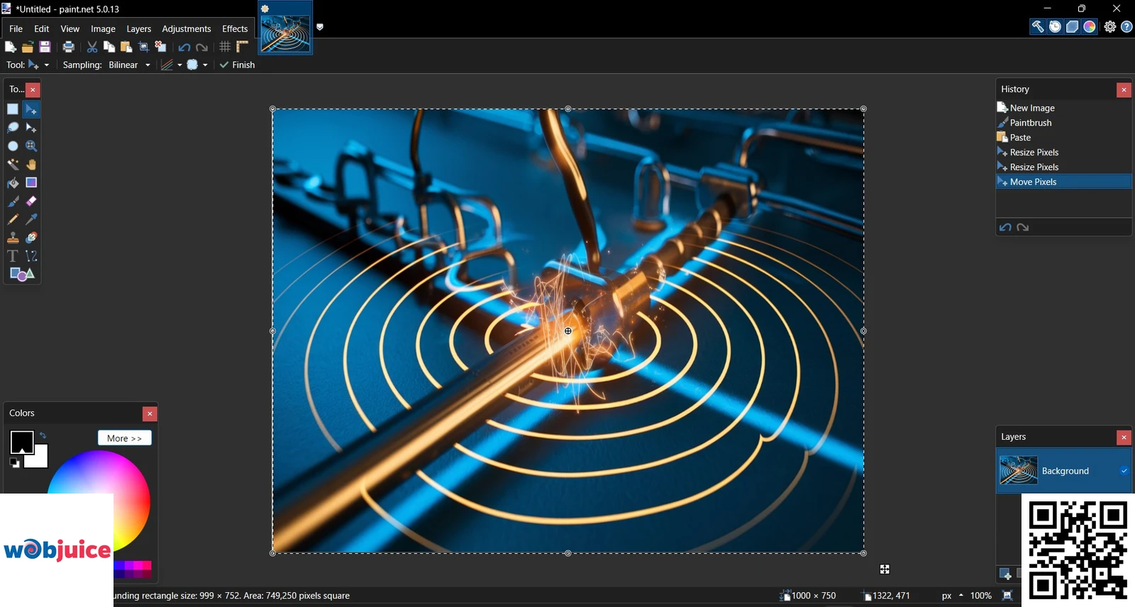
Tools for Resizing Images
Popular online options like Canva and Pixlr provide quick and simple ways to change image sizes and fit them for different devices.
For those who like using desktop apps, Adobe Photoshop has strong tools for resizing images without losing quality.
Free options like GIMP and Paint.NET also have good tools for resizing.
When you pick a tool to resize images, think about what you need and how your website looks.
Big images can make your site slower. This can hurt your SEO rankings.
By adjusting images to the right size before you upload them, you improve user experience and site performance.
The right tool for resizing can save time and make your website work better.
When you invest in image optimization, it helps improve your SEO.
This also makes your website load faster, which leads to more people getting engaged and taking action.
Choose carefully, and your site can do well.
Make sure to match image sizes with your website’s design.
This helps it work better on various devices and screen sizes.
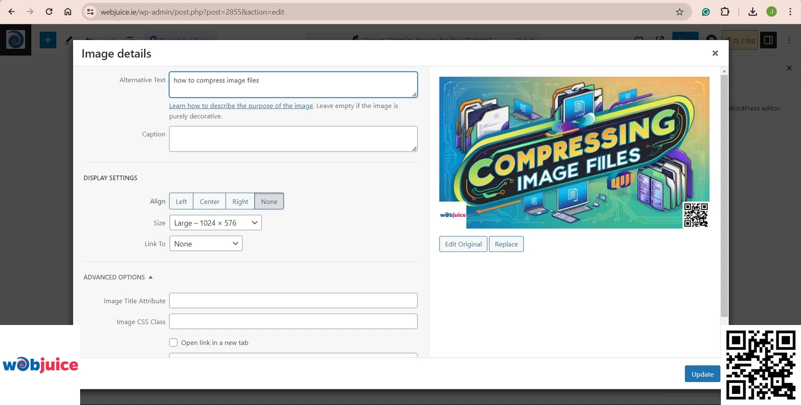
Compressing Image Files
Implementing effective on-page SEO techniques, like optimizing images, is important for making your website easier to find and rank higher in search results.
Compressed images speed up loading times.
This is important for keeping visitors on your site.
Users usually leave websites that take longer than three seconds to load.
Good image sizes can help cut bounce rates and increase engagement.
You can use different tools to make images smaller.
Use tools like Adobe Photoshop or free online options like TinyPNG and ImageOptim.
These apps help you manage both quality and file size.
This means your images will look good and load fast.
Remember to pick the right way to compress your images.
Different types of images may need different methods.
Always test your compressed images to make sure they keep good quality.
With the right way to compress, you can greatly improve your website’s speed.
This can be done without losing how good it looks.
Utilizing Alt Text
To use alt text effectively, keep it brief and clear.
Focus on the main part of the image.
Don’t overuse keywords.
Use simple language that fits with your text.
Remember to add alt text to all important images on your site.
This should include product photos, infographics, and any image that shares key information.
Importance of Alt Text
By adding clear text for images, you help visually impaired users grasp your content using screen readers.
This practice makes the experience better for everyone and shows that you care about accessibility rules.
Alt text helps search engines understand your images.
When you use the right keywords in your alt text, your images can show up more in search results.
Using alt text can lower bounce rates.
When users see images that clearly show your message, they are more likely to interact with your content.
In simple terms, adding alt text is not just a choice; it is a smart step that helps your audience and improves how your website appears.
Use this practice to make the user experience better and to improve your site’s search engine results.
Best Practices for Implementation
To get the best results from alt text, focus on writing clear and detailed phrases that show what your images are about.
Alt text is an important part of your website’s SEO plan.
It helps people access your site better and boosts your rankings on search engines.
When you describe an image, focus on the keywords that match your content.
Use clear words that connect to what your audience is looking for.
Keep your alt text short, ideally under 125 characters.
This makes it easy to read and understand for users and search engines.
Do not stuff it with keywords. Instead, focus on a natural flow that improves the user experience.
Regularly check your images and their alt text.
Make sure they stay useful and correct as your content changes.
By using these best practices, you can improve your site’s accessibility.
You can also show that you know what you are talking about in your area.
Implementing Lazy Loading
To get started, you can use native HTML attributes like ‘loading=”lazy”‘ in your ” tags.
This simple change tells browsers to wait to load those images until they are close to being visible on the screen.
If you use JavaScript, tools like LazyLoad or Intersection Observer can help you.
They let you decide when and how images load.
The benefits are clear. Faster load times mean lower bounce rates.
Search engines like this. A well-optimized site can boost your SEO rankings.
It can also bring in more visitors.
Also, when less data is loaded at first, users on mobile devices or slow connections will have a better experience.
Creating Responsive Images
By using the ‘srcset’ in your HTML, you can show different image choices.
This helps the browser pick the best one for the user’s device.
Also, using CSS for responsive design improves how images are shown.
Setting the width to 100% lets images resize well in their boxes, so they don’t get stretched.
It’s important to keep the right aspect ratios, so think about using the ‘height’ to ‘auto’.
Don’t forget about accessibility. Always add ‘alt’ text for images.
This will help your SEO. It also helps visually impaired users understand your content.
Creating responsive images helps make your website look better.
It can also help you rank higher on search engines.
Your dedication to this practice will surely bring good results.
Leveraging Content Delivery Networks
A CDN shares your images across several servers around the world.
This way, users get the content from the server that is nearest to them.
This greatly reduces wait time and speeds up load times.
When you add a CDN to your website, you make it better at delivering images.
You also lessen the work on your main server.
Additionally, CDNs often offer features to improve images.
These include automatic resizing and changing formats.
They can make images look better while keeping file sizes small.
Using a CDN can improve your website’s SEO.
Faster loading times result in lower bounce rates, which search engines like.
By making the user experience better and keeping performance high, you help create a better place for search engine rankings.
It can improve how your website works and how many people see it.
Don’t ignore this strong tool in your plan to optimize images!
Regularly Auditing Image Performance
Regular image checks are important for keeping your website running well and for engaging users.
They help find images that aren’t doing well and make sure your visuals fit with the latest SEO advice.
Start by checking load speed and user interaction data.
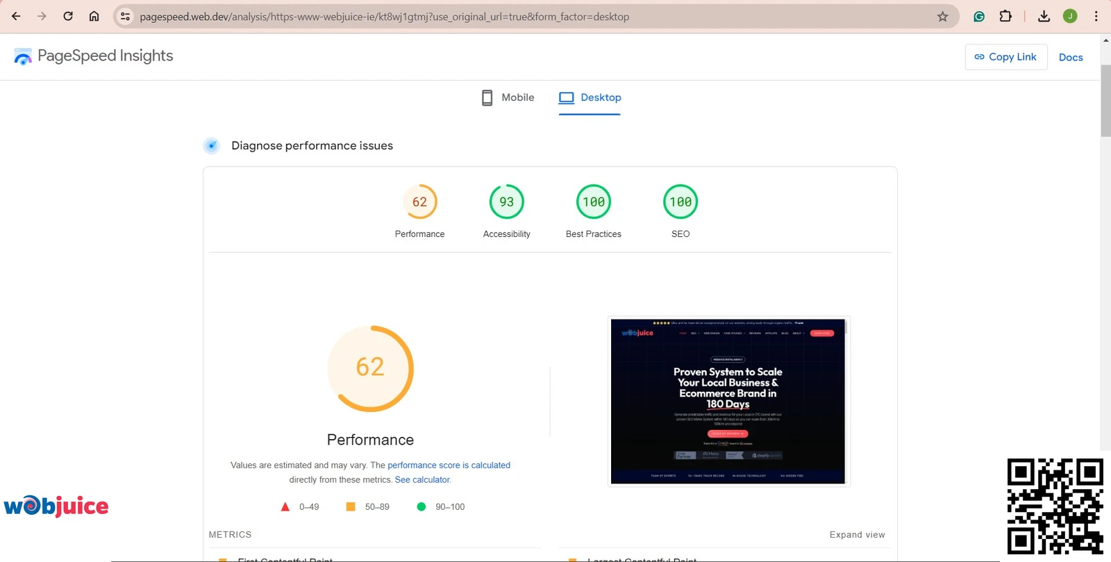
Google PageSpeed Insights can provide helpful information and show where you can improve.
If some images do not perform well, change them out for better options or redesign them.
These audits also check for correct alt text, file formats, and how files are sized.
This helps your images follow the latest rules and support your SEO work.
Committing to regular checks improves how users feel about your website.
This helps to reduce bounce rates and increase how many visitors take action.
Remember, it’s not just about how your images look. It is also about how they work.
By focusing on how images work, you can improve your SEO plan and connect better with your audience.
Carefully checked images are strong ways to boost your website and help it do well.
Do not underestimate how much they affect your online presence.
Image Optimization FAQ
Expert answers to boost your website speed, SEO rankings, and accessibility through proper image handling techniques
Why is image file format choice so critical for my website’s performance?
Selecting the optimal image format directly impacts your Core Web Vitals—Google’s key ranking signals for user experience. Each format serves distinct purposes with measurable performance implications:
Format Performance Breakdown:
- JPEG/JPG: Ideal for photographs with complex color gradients. Uses lossy compression to reduce file sizes by up to 80% while maintaining visual integrity for human perception.
- PNG: Essential for graphics requiring transparency or lossless quality. PNG-8 for simple icons; PNG-24 for detailed screenshots and graphics with text overlays.
- WebP (Modern Standard): Google-developed format providing 25-35% smaller files than JPEG/PNG at equal quality. Supports both lossy and lossless compression with transparency.
- AVIF (Emerging): Next-generation format offering up to 50% compression improvement over JPEG while supporting HDR and wider color gamuts.
Strategic format selection reduces HTTP request payloads, decreases bandwidth consumption for mobile users, and directly improves Largest Contentful Paint (LCP) scores—a critical ranking factor that measures loading performance.
SEO Pro Tip: Implement responsive images with the <picture> element to serve WebP/AVIF to supported browsers while providing JPEG/PNG fallbacks for maximum compatibility and performance gains.
How does image resizing differ from compression, and do I need to do both?
These are sequential, non-negotiable steps in the optimization pipeline that address fundamentally different technical challenges:
- Resizing (Dimensional Optimization): Adjusts the physical pixel dimensions (width × height) to match your layout’s display requirements. Uploading a 4000px image displayed at 800px wastes 400% bandwidth and processing resources.
- Compression (File Size Optimization): Reduces the digital file weight (KB/MB) through algorithmic data removal without altering pixel dimensions. Modern tools like Squoosh, ImageOptim, or ShortPixel achieve 60-80% size reduction with imperceptible quality loss.
The Critical Workflow: Always resize first to exact display dimensions, then apply compression. Tools like Sharp (Node.js) or WordPress plugins can automate this pipeline during upload.
SEO Pro Tip: Monitor Google Search Console’s Core Web Vitals report. Images contribute significantly to LCP (Largest Contentful Paint). Proper resizing and compression often move sites from “Needs Improvement” to “Good” status.
What makes “alt text” (alternative text) so important for SEO and accessibility?
Alt text serves as a critical accessibility compliance feature and powerful SEO contextual signal with measurable ranking impact:
Dual-Purpose Functionality:
- Accessibility & Compliance: Screen readers rely entirely on alt text to describe images to visually impaired users. Proper alt text is required for WCAG 2.1 AA compliance and ADA accessibility standards.
- Search Engine Context: Google’s algorithms cannot visually interpret images. Alt text provides semantic understanding, helping search engines index images accurately and rank them in Google Images (which drives 22% of all website traffic).
Optimal Alt Text Structure: Use descriptive, keyword-rich but natural language. Instead of “coffee,” use “freshly brewed Ethiopian Yirgacheffe coffee in white ceramic mug on wooden table.” Include product attributes, context, and action when relevant.
Special Cases: Decorative images should have empty alt attributes (alt="") to prevent screen reader clutter. Complex infographics may require both alt text and detailed captions or linked descriptions.
SEO Pro Tip: Google Images represents a massive traffic opportunity. Well-optimized images with descriptive alt text can rank independently in image search, creating additional entry points to your site beyond traditional organic results.
What is “lazy loading,” and how does it improve my site’s initial load time?
Lazy loading is a performance optimization technique that defers loading of below-the-fold images until users approach them during scrolling. This creates significant improvements in key metrics:
- Mechanism: Using the native HTML
loading="lazy"attribute or JavaScript libraries, images outside the viewport remain unloaded until approximately 200px from visibility. - Performance Impact: Reduces initial page weight by 40-60% on image-heavy pages, dramatically improving First Contentful Paint (FCP) and Largest Contentful Paint (LCP) metrics.
- Resource Efficiency: Saves bandwidth for mobile users and reduces server load by preventing unnecessary image requests that users might never view.
Implementation: Modern browsers support native lazy loading with simple HTML: <img src="product.jpg" loading="lazy" alt="...">. For complex implementations, Intersection Observer API provides JavaScript control with callback options.
Critical Consideration: Never lazy-load images in the immediate viewport (hero images, logos). These should load immediately as they contribute to LCP scoring. Reserve lazy loading for images further down the page.
SEO Pro Tip: Google PageSpeed Insights specifically recommends lazy loading off-screen images. Proper implementation can improve your mobile performance score by 15-30 points, directly impacting mobile search rankings where Core Web Vitals are now ranking factors.
How often should I audit my website’s image performance, and what should I check?
Establish a quarterly audit cadence, with monthly checks for high-traffic sites or after major content updates. Use this comprehensive checklist with specialized tools:
Quarterly Image Audit Checklist:
- Format Analysis: Audit for WebP/AVIF adoption opportunities using Chrome DevTools → Network panel
- Dimension Verification: Check if display dimensions match source dimensions with Lighthouse audits
- Compression Quality: Test recompression potential with Squoosh.app or ImageAlpha
- Alt Text Coverage: Run accessibility scans with axe DevTools or WAVE
- Lazy Loading Implementation: Verify with Chrome’s Coverage tool or PageSpeed Insights
- Responsive Image Implementation: Test
srcsetfunctionality across viewport sizes - CDN Configuration: Verify proper cache headers and geographic distribution
Essential Audit Tools:
- Google PageSpeed Insights: Provides actionable recommendations with estimated savings
- Chrome DevTools: Network panel reveals actual loaded sizes; Lighthouse for comprehensive audits
- WebPageTest: Advanced testing with filmstrip view showing image loading sequence
- Screaming Frog SEO Spider: Crawls entire sites to identify unoptimized images at scale
Conclusion
Picture this: A website that loads in a blink, looks flawless on every device, and climbs search rankings with ease. This isn’t a fantasy—it’s the direct result of disciplined image optimization. You now hold the blueprint.
Remember Your Core Victory Formula:
Right Format + Perfect Size + Smart Compression = Speed & Quality.
This foundation, powered by strategic alt text and responsive design, does more than just pretty up your pages. It builds bridges for all users and sends a clear, commanding signal to search engines that your site is a top-tier destination.
The Final, Critical Step: Don’t Just Learn—Execute.
Knowledge unused is opportunity lost. Begin your audit today. Run each image through the checklist you’ve mastered. Feel the satisfaction as your page speed scores soar and your engagement metrics transform.
Your competitors’ images are weighing them down. Let yours be the engine of your growth. Optimize, outperform, and own your space online.
Your audience is waiting. And now, your site is ready.
